I ran across a headline today on a newspaper’s website that gave me pause — not because of what it said, but because of what it didn’t say.
It happened to be on the Des Moines Register’s website, but I don’t want to specifically diss them. I see this on lots of websites, particularly when I’m using my laptop and I’m reading a website that doesn’t use responsive design.
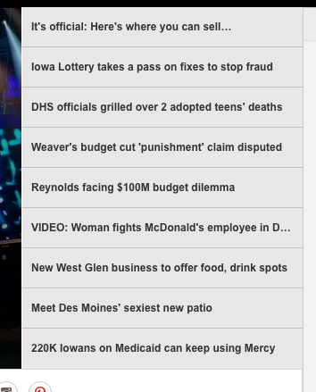
 This was a the top of the Register’s desktop website today. If you know even a little bit about how websites work, you can tell that there’s more to the headline of the first story on the list. But the content management system apparently limits the characters displayed in this home page position, so the entire headline doesn’t appear.
Of course, as a reader, it made me wonder. What is it that I can sell that’s now official?
One way to look at this is that perhaps the missing word will make people curious and they’ll click. But I think it’s equally likely that someone who would have read the story based on the “what” is just going to pass it by because they’re missing that keyword.
Being aware of this issue, and how to fix it, is part of the copy editor’s job of being an advocate for the reader.
I admit I clicked on the story, but only because I saw it and thought, “great fodder for my editing class.”
(You can see the same issue on the VIDEO story.)
The screenshot below is from the Register’s mobile site. It fills in the missing words.

I don’t know what the Register’s CMS is like. But I know many allow for different mobile and desktop headlines. And even if they don’t, if you take “It’s official” off that headline, the word “fireworks” will fit on desktop and the headline still tells readers what they need (and what) to know.
I tell editing students to check the website after they post, to check what the reader’s experience is going to be. There are equal issues with a wide two-line headline on a desktop site that collapses down to a 6-line headline on a responsive mobile site. The information might be there, but the aesthetics aren’t pleasing, and that also might keep people from reading.
Good headline writing is still an art that has structure. Just because online you don’t have to worry about what will fit in a 1 column, 3 deck, 60 point headline doesn’t mean you should abandon good form.

What I have found also on newspaper and TV news websites is a frequent absence of the location of the entity. There is often not a single word on the page to indicate where the newspaper is or where the TV station is. Sometimes, there are clues, but sometimes they are too subtle, such as county names.
LikeLike
I agree. Last week, I was talking to a group of editors about this regarding full dates as well. On the main website I deal with, one of the highest traffic stories is from 2015. Without a full date, who knows that.
LikeLike
Hi! Des Moines area native and hopeful future copy editor/proofreader here. I wish I could say this surprises me, but ever since Gannett bought out the DM Register, the paper’s quality plummeted. Granted, I do have a grudge with Gannett ever since it laid off many copy editors. (The NY Times might have to be on that list soon, unfortunately.)
Otherwise, I’m glad I took a web design class my last semester. I’m much more careful to check appearances on more than one device. Still, I’ll take this tip into account.
LikeLike